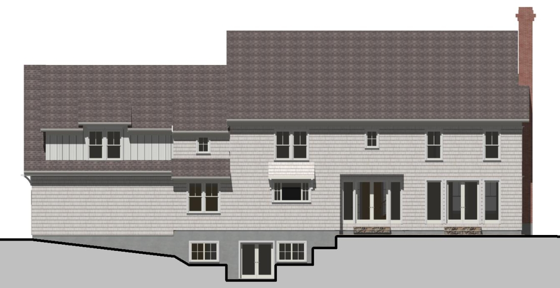
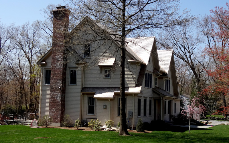
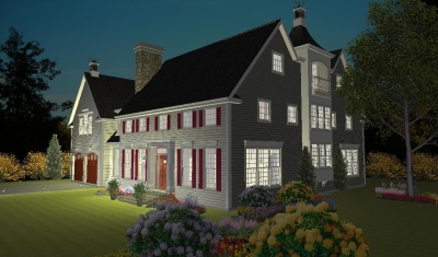
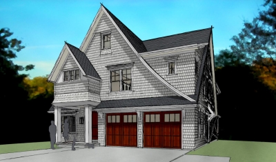
This is a favorite of mine, as it carries lots of interest (various roofs, shadow lines, variations in depth), yet was simple to build. Other twin-front gables you see around town are more complicated in their framing. This home uses an architectural trompe-l’oeil effect: the first two stories are framed just an ordinary “boxy” colonial; the gables are basically glorified dormers flush with the front of the house, and the rake/overhang extends down across the otherwise flush front wall to create “separation”. Less complicated, same (I think better) effect, and less costly.
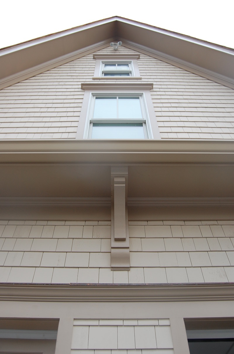
The varying depths of roof eaves create a hierarchy that helps this further. The layperson may not understand all the thought that goes into achieving this effective look; but the response is unanimously one of pleasure.
Other little details made this home a “fun” one. The builder opted to bump a gas fireplace box out the side; instead of the typical “builder bumpout”; we celebrated the variation with brackets, a roof the integrated the bumpout into the façade as a whole, and flared a curved roof over a small window aligned above just to make it that much more special. Inexpensive but thoughtful detailing = Big effect.
Attention to Detail. Symmetry. Alignment. Heirarchy. Trompe L’oiel And yet, easy and cost-effective to build. All these are not critical to every project, but together they made this one a success. And I’d add that a functional builder-architect relationship founded on effective communication and mutual respect provided the foundation for this one.
